Youth Conference logo, poster and website design
A few months ago I started working with Youth for Christ to brand a new Youth Conference for Senior High Students and their leaders. This process involved an initial conversation to discuss the vision for the conference and brainstorm some logo concepts. I then set out to create 5 different logo variations for them to choose from. After the initial review we started fine tuning the concept they liked the most until we arrived at the final design pictured below.
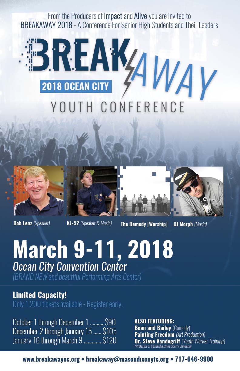
My next task was to build off of this logo and create an eye catching poster that could be used to advertise the youth conference. You can preview the final poster below:
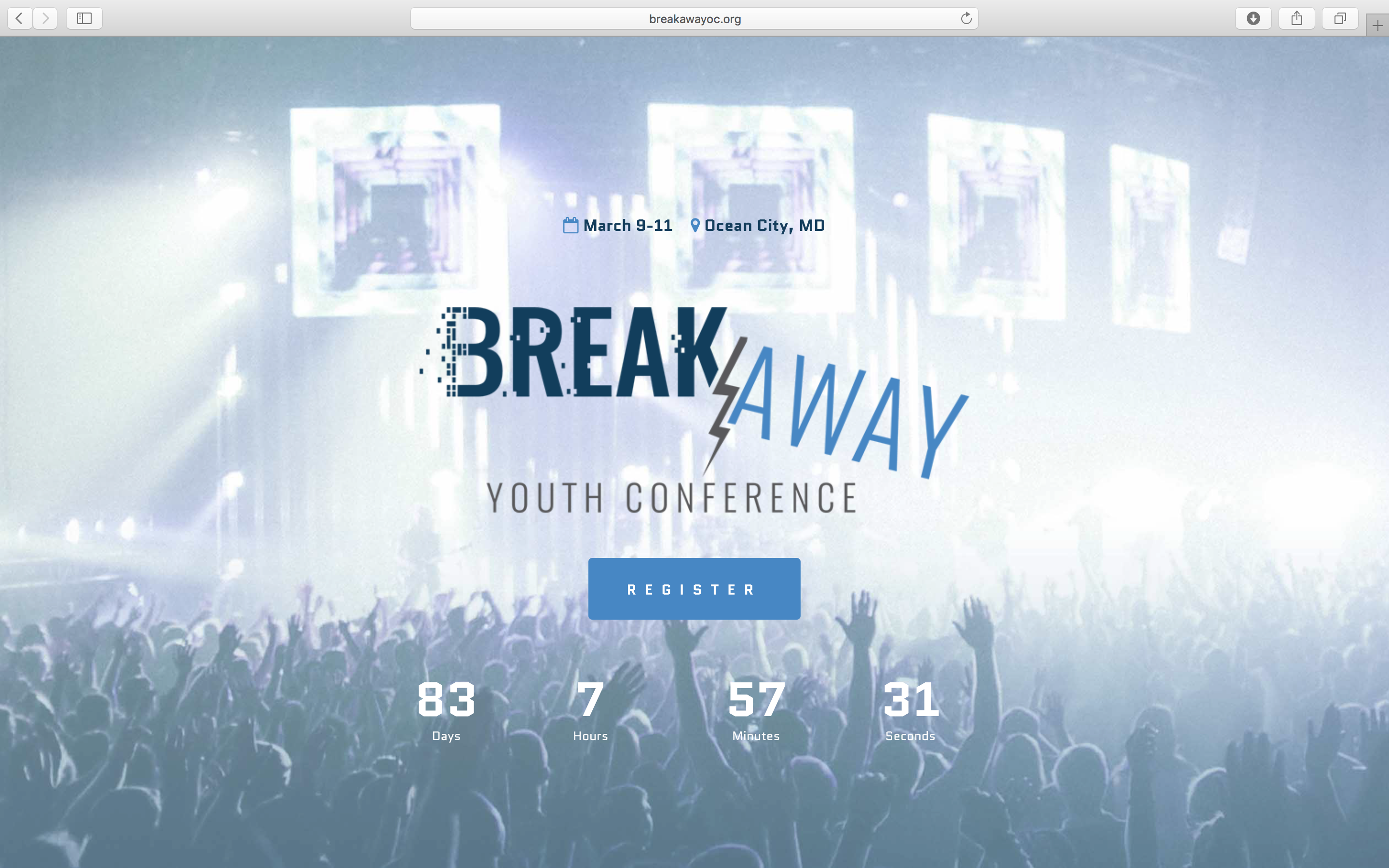
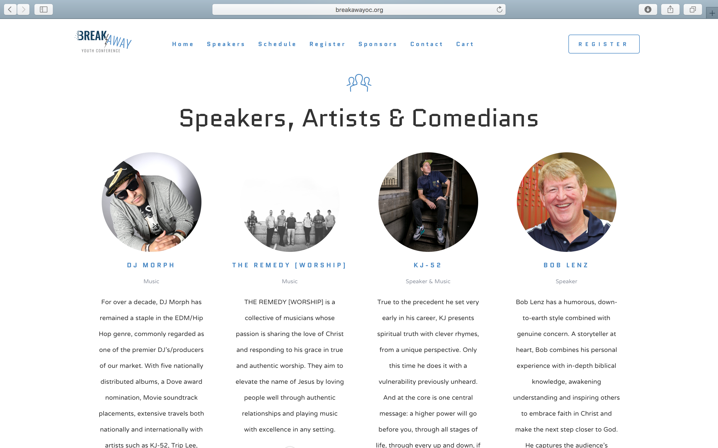
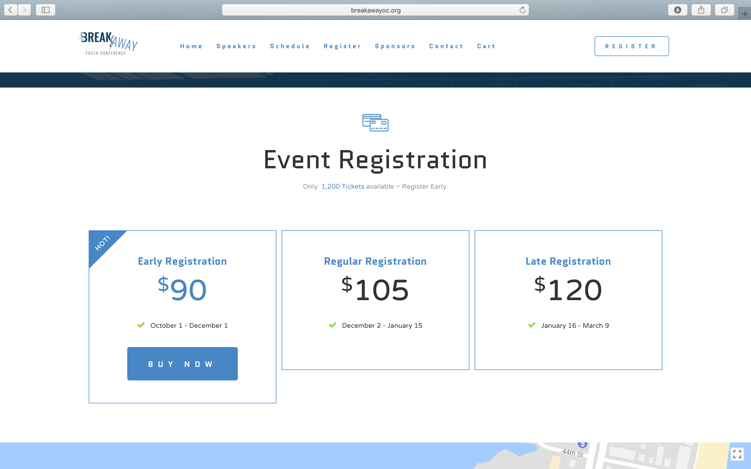
Finally, I needed to build a brand new website for the conference that was visually appealing, user friendly and capable of handling heavy traffic when tickets went on sale. Building off of the logo and poster concept I created what we now know as breakawayoc.org. This website has a user friendly ticketing system built in which allows visitors to purchase tickets without having to leave the site.


